
At Solutions Mesonet, every forecast is probabilistic: uncertainty is part of the information, not the problem.
A traditional weather forecast usually presents only one scenario: the forecast temperature, the expected rainfall amount, or the most likely wind speed — this is known as a "deterministic forecast." While easy to communicate, this approach can create a misleading impression of certainty. In reality, the atmosphere is an extraordinarily complex system, and weather observations can capture only a fraction of its complexity. As a result, multiple future outcomes remain possible from the same observed atmospheric state.
Ensemble forecasting explicitly acknowledges this reality. Instead of producing a single version of the future, it simulates a large number of plausible scenarios, each consistent with the available observations and the inherent limits of our knowledge of the atmosphere.
Rather than hiding uncertainty, this approach makes it an integral part of the forecast. Knowing that an event has an 80% chance of occurring is fundamentally different from knowing it has only a 20% chance.
Weather Forecasts: Don't Fight Uncertainty, Leverage It.
Learn more: Read a Forecast Like a Meteorologist: A Guide to Probabilistic Forecasting
Our charts display 51 credible scenarios instead of just one, using two chart styles. Here's how to read them.
The principle
Weather forecasts will never fully get rid of a certain degree of uncertainty. That information shouldn't be left out, because — paradoxically — it lets you make better decisions when a forecast is presented to you. Uncertainty is built into ensemble forecasts.
An ensemble forecast is…
The weather model simulates the atmosphere about fifty times, starting from slightly different initial states and computation methods. The result is roughly fifty different scenarios, all equally credible.
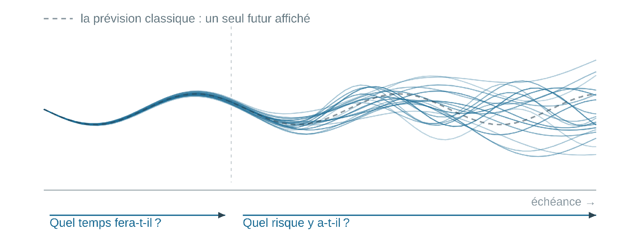
In the first part of the forecast (near future), the differences are still small, the bundle of scenarios stays tight, and they agree on the details; past a certain point (far future), the differences grow, the bundle widens, and several possibilities emerge that can't yet be ruled out.
A wide spread doesn't make the forecast useless. It's not the forecast's usefulness that drops — it's the question it can answer that changes.
Ensemble forecasts are shown graphically using two visual styles: probability density, and vertical bars.
Style 1 · Probability density
Colors show how spread out the scenarios are
For each value, we count the proportion of the 51 scenarios that fall within a pre-defined window called the margin of error — here 2 °C in our temperature example.
Purple and pink mark the core of the bundle, where most scenarios cluster together. Orange, then pale yellow, correspond to values where scenarios are increasingly spread out. The palest fringes represent less than 5% of scenarios (unlikely, but not impossible).
The color does not give the probability of crossing any given threshold. It only shows how closely the scenarios cluster around a given value. That said, it also means the most probable scenarios will always fall within the "densest" colors for a given lead time.
This style applies to most variables: temperature, humidity, wind speed and direction, precipitation totals, and several others.
Details
How to determine the risk of crossing a value
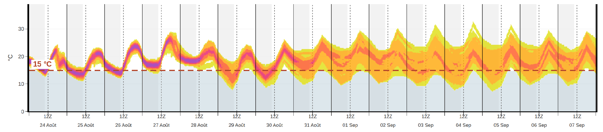
This chart style is often used, among other things, to estimate the probability that a threshold will be crossed. For example, if dropping below 15 °C affects your activities or operating costs (e.g., triggering your greenhouse's heating system), proceed as follows:
- Find the value that matters to you on the vertical axis — 0 °C, 20 mm, 60 km/h, etc. (here, 15 °C).
- Follow it horizontally to the lead time you're interested in.
- Estimate what share of the bundle falls on the wrong side. A single pale fringe crossing the line = a few percent, unlikely. A large part of the thickness = high probability and risk.
Style 2 · Vertical bars
Three precipitation-related variables
Three precipitation-related variables are shown as translucent vertical bars: average intensity, maximum 3-hour intensity, and probability of occurrence.
Each scenario corresponds to a low-opacity vertical band. At each lead time, the bands stack up and their opacities add together: the more opaque the area in front of a value, the more probable that value is, because many scenarios pile up there. An isolated, pale band is a minority scenario (but not an impossible one).
1 · Average intensity

The value shown is the precipitation total over an interval, converted to mm/h. "5 mm/h over 3 hours" means that if the intensity held steady, 15 mm would fall. The interval is one hour for the first 90 hours of the forecast, then 3 hours up to day 6, then 6 hours.
- "Will it rain?" That's the proportion of scenarios that aren't stuck at zero.
- "If it rains, how much?" That's the height reached by the bands.
Average intensity is not the intensity felt at any given moment. A one-hour storm could produce 12 mm/h for fifteen minutes, then 2 mm/h for the remaining forty-five: the total is only 4.5 mm, and the average intensity over the hour is 4.5 mm/h.
2 · Maximum 3-hour intensity
Maximum 3-hour intensity (bottom)

Same chart style, but the value shown is the strongest instantaneous intensity encountered within a 3-hour window — it can occur at any point within that window.
On the afternoon of August 27, the most likely average intensities are 2 to 4 mm/h, while instantaneous peaks could exceed 10 to 15 mm/h for brief periods.
3 · Probability of occurrence
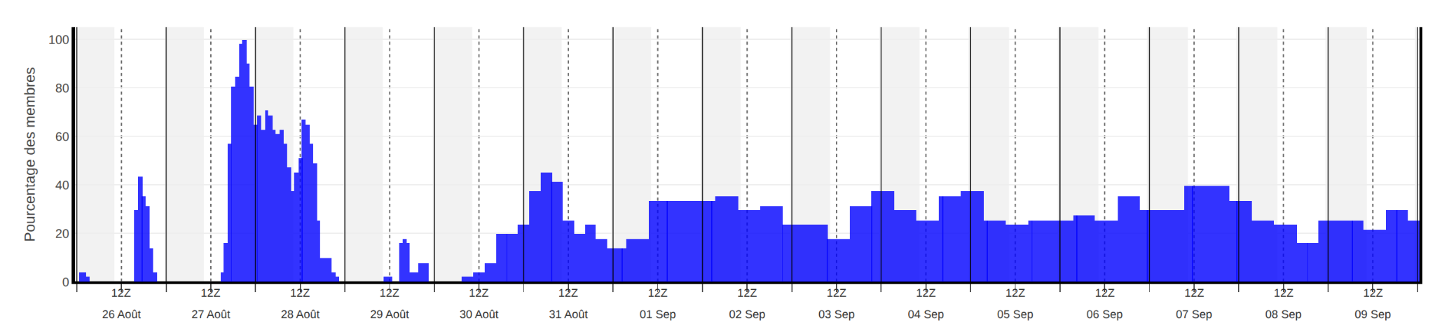
This chart shows a single series of bars, not a stack: it gives directly the fraction of the 51 scenarios whose average intensity exceeds the measurable threshold of 0.1 mm/h. For example: a bar at 30% means about 15 of the 51 scenarios produce measurable precipitation.
A high probability of precipitation is not the same thing as a high intensity — these are two completely independent quantities. For example, around midday on August 26, very low intensities were forecast, yet with a relatively high probability of about 40%.
Details
"Cumulative" variables

Several variables shown as probability density are cumulative totals from the start of the forecast (starting at zero), and can only increase. For precipitation, they are derived from the average intensities. Other cumulative variables include snowfall, freezing rain, actual and potential evaporation, and hours of sunshine.
The cumulative view shouldn't be overlooked, especially for precipitation: rain filling a ditch, soil becoming saturated, snow piling up on a roof, ice forming on a power line — these are questions of total quantity over a period, not hourly intensity.
A few important reminders
Keep in mind
- Times are in UTC. In Quebec, subtract 4 hours in summer and 5 hours in winter. The 0h UTC mark falls in the evening of the previous day — 8 PM in summer, 7 PM in winter — and 12h UTC corresponds to 8 AM the same day.
- Grayish zones: nighttime periods. The solid and dashed vertical lines mark 0h and 12h UTC, respectively.
- Some variables stop at 6 days. Maximum 3-hour intensity and maximum 3-hour wind gust are only forecast 6 days out: the blank space beyond that does not mean a value of zero.
- Forecasts refresh every night — a fresh forecast is waiting for you every morning.
Watch out!
Three pitfalls to avoid
- A low probability doesn't mean impossible. The palest fringes are unlikely, but can't be ruled out for that reason alone. Reality could very well end up there.
- Color is not the probability of crossing a threshold. To assess risk in that sense, draw the line that matters to you and measure the share of the bundle — color alone doesn't answer that question.
- The limit of predictability shifts. It changes from day to day and season to season, and it reaches much further into the future for temperature than for precipitation.
For more details, read the full article : « Les prévisions météo : ne combattez pas l’incertitude, exploitez-la ».
